Evaluate all user-facing links, pages, and assets on the Austin History Center website to ensure content is accurate, meaningful, and aligned with user needs.
The core principle throughout: Every content and navigation decision is evaluated from the perspective of a new, unfamiliar visitor — not an archivist, not a returning researcher, not staff. If a first-time visitor can't understand it, it gets flagged.
All AHC-owned webpages — evaluated for content quality, value, accuracy, redundancies, and navigation gaps.
Pages we cannot edit (APL catalog, external databases) are evaluated for placement only.
"Is this the right place for a user to find this link?"
7 User Intent Categories Applied to All Content
Every page and link in the audit receives one of six action labels. These drive every decision about what stays, what changes, and what goes.
Content is accurate, useful, and correctly placed. No changes needed.
Content is valuable but outdated or unclear. The page stays; the words change.
Link text or page title is misleading. The content is fine — the label isn't.
Multiple pages serve the same purpose. Consolidate into one destination.
Content is useful but in the wrong section. Move it; don't rewrite it.
Content provides little or no value to visitors. Flagged for deletion or archival.
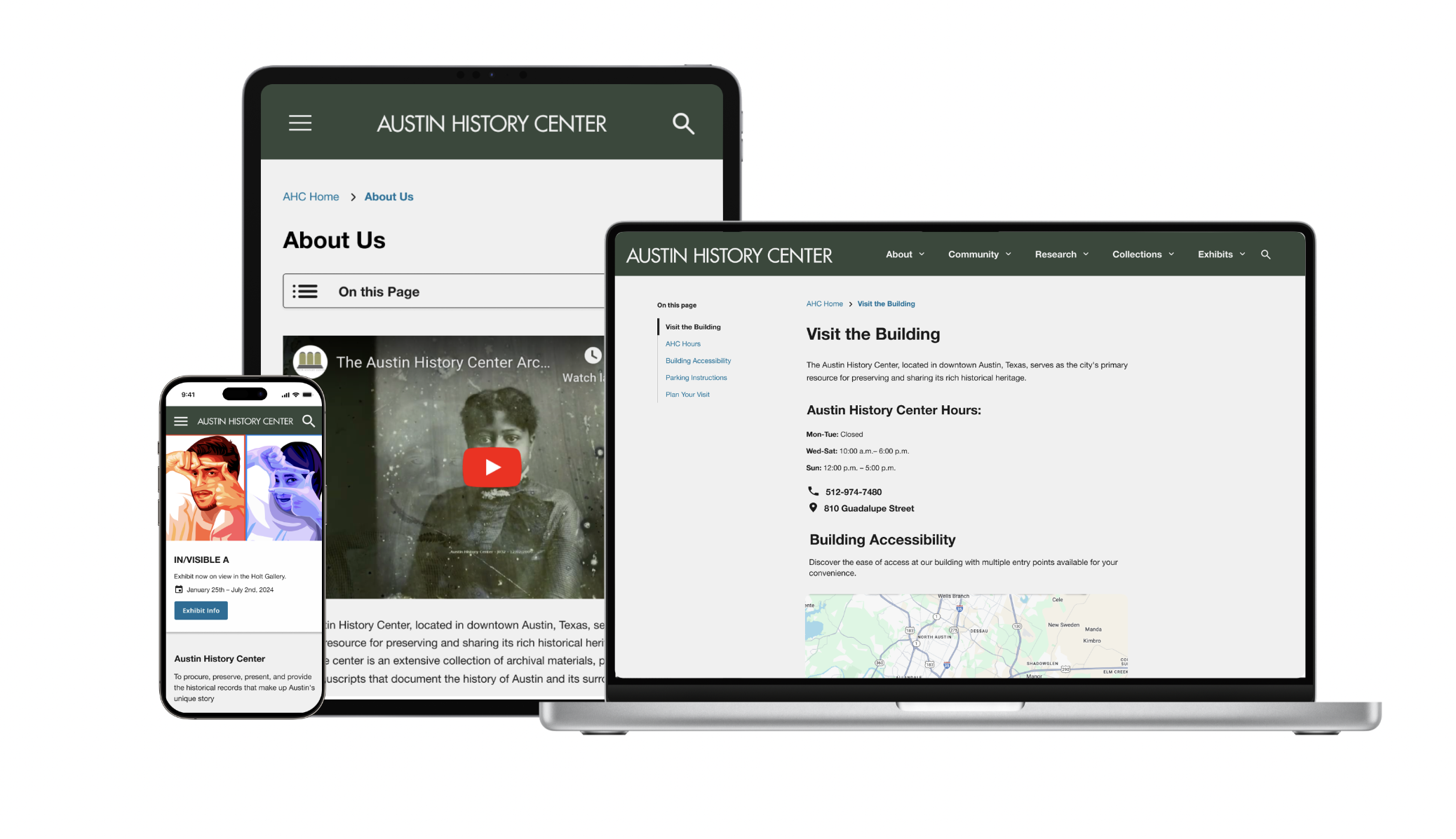
The current site has 7 flat navigation items, several of which use institution-facing language. The proposed structure reduces to 6 clearer, visitor-focused sections.
A three-level hierarchy: nav label → subpage → content sections within subpages.
Utility bar: Search · Spanish · Donate/Volunteer CTA · Library Login | Footer: Contact Us · Plan A Visit · Policies · APL · Social · Newsletter
For each of the 6 navigation sections, we've mapped what exists today against what the proposed nav structure requires.
Clearer task-based label for users seeking copies of archival materials.
Reflects community participation intent — visitors contribute, they aren't "outreach targets."
Consolidated into a single nav item to reduce top-level clutter.
Eliminated orphaned page; consolidated under Plan A Visit where visitors look first.
No images across the current main navigation pages have alt text — a gap that affects screen reader users and fails WCAG AAA requirements.