How In-Depth User Research Improved Content Discoverability at the Austin History Center
UX Research
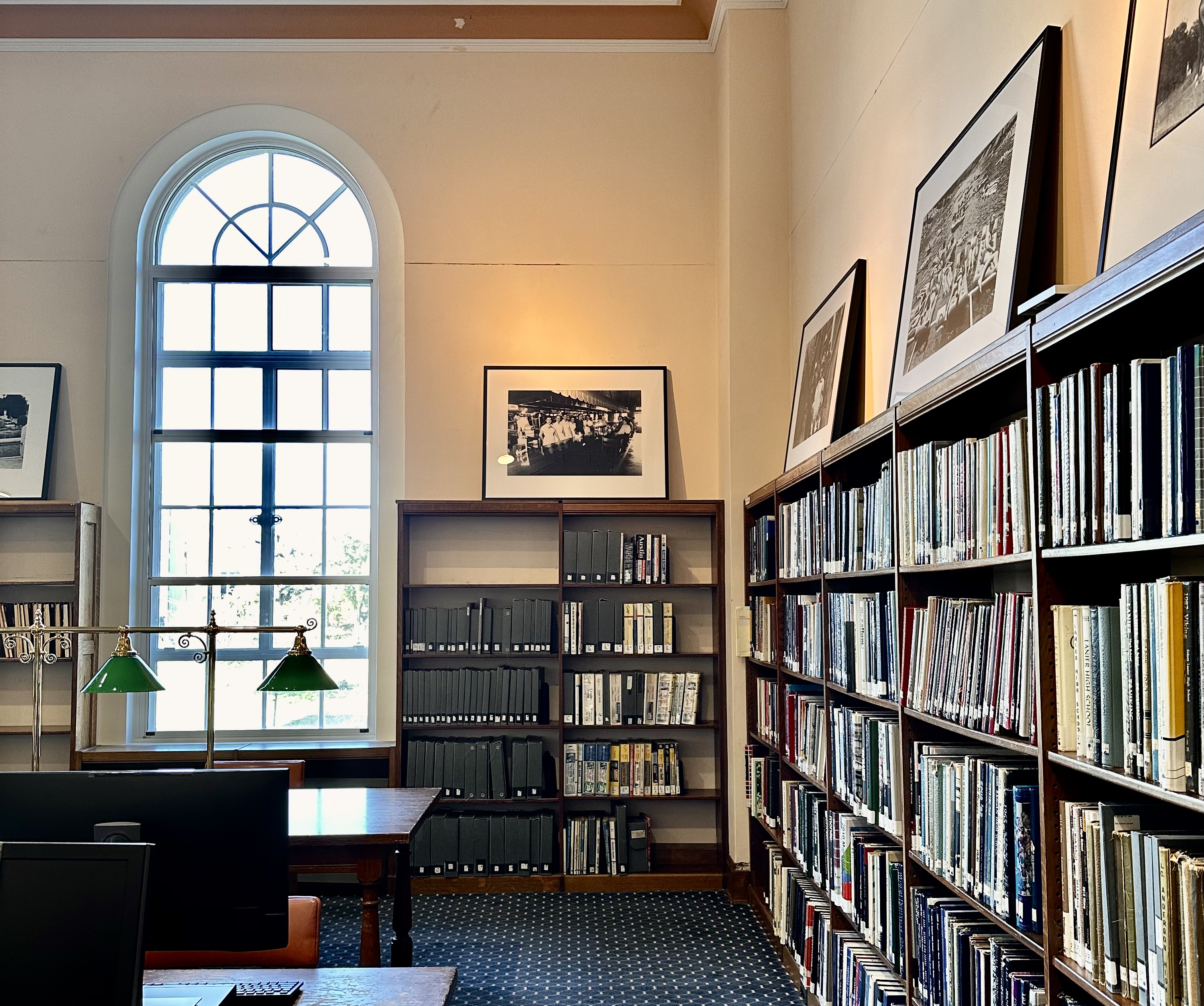
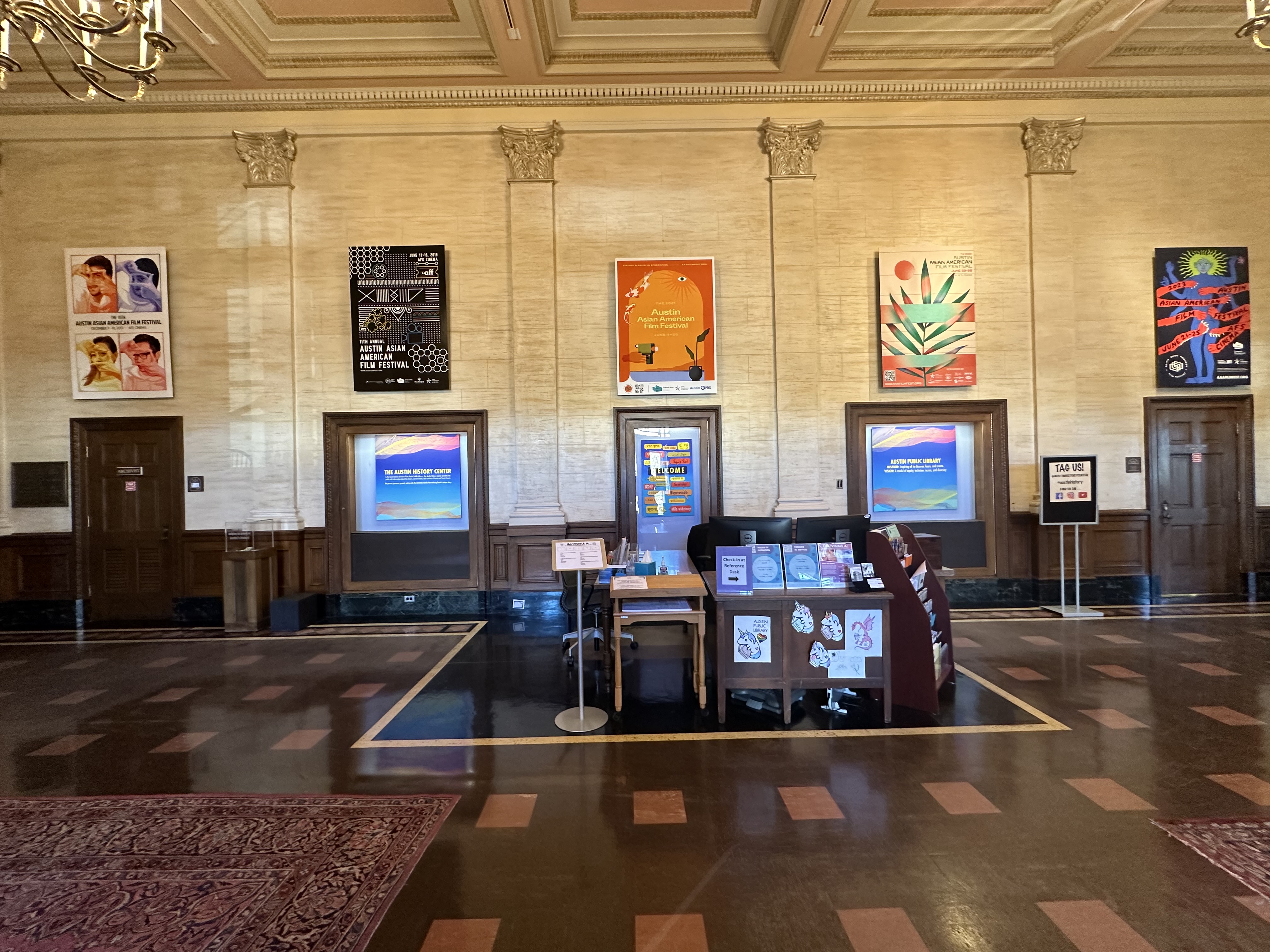
Austin History Center
2024
Replacing a confusing PDF with a clear, accessible image request form that’s faster, easier to use, and simpler for staff to process.
Intro
Usually, the sites of institutions that provide financial services are full of information. Our goal was to provide the maximum of information to potential customers of Webflow, but to do it in a stylish and modern way.
Minimalism combined with elements of french typography and brutalism helped us to realize the site exactly as we imagined with the client at the beginning: visually restrained, but stylish. Informative and pleasant to use, with an elegant aftertaste of a serious financial institution.
The Problem
While staff could guide users effectively in person, the website presented dense, overwhelming content that confused new visitors. Users struggled to find basic information without contacting the center directly.
What I did
- Led project planning and team meetings to align stakeholders, set priorities, and drive progress across design milestones.
- Conducted a competitive UX analysis of peer archive websites, focusing on content structure, navigation patterns, and accessibility approaches for digital archival records
- Planned and conducted user interviews to deeply understand target user needs, behaviors, and key pain points with the existing website.
- Designed and facilitated usability testing sessions to evaluate navigation flow, content clarity, and interaction patterns—directly informing iterative design improvements.
- Designed an evidence-based table of contents (TOC) pattern for content-heavy pages, validated through usability testing to improve content discoverability and navigation efficiency.
- Conducted comprehensive accessibility audits (manual and automated) to ensure compliance with US Web Design System (USWDS) and WCAG 2.1 AA standards.
- Collaborated closely with business stakeholders and legal teams to ensure content accuracy, clarity, and alignment with organizational requirements and public service goals.
- Delivered detailed design specifications and assets to developers and provided implementation QA to ensure design fidelity and accessibility compliance during build.
Impact
Through in-depth user research and testing, I identified key pain points that shaped high-impact design decisions—improving accessibility, navigation, and overall usability for Austin History Center’s diverse user base.
80% of users relied on the new table of contents to quickly locate target information without needing assistance.
Conducted in-depth user research to uncover key pain points, directly shaping design decisions.
Simplified content and structure led to increased task success and reduced user frustration.
Applied USWDS accessibility guidelines for compliance and inclusive design.
Understanding Business Requirements
Brand Differentiation
Clearly distinguish the Austin History Center from the Austin Public Library.
Content Organization
Reorganize content to improve navigation and enhance readability
Accessibility
Ensure the website is inclusive and complies with USWDS (U.S. Web Design System) guidelines.
Research
goals
- Identify pain points and unmet needs
- Hone in on a target audience
- Understand how users interact with historical content online
- Research how other government entities digitize and store archival records
UX COMPETIVE ANALYSIS
Initially, I conducted a competitive analysis of the DC History Center to better understand their strengths and weaknesses, and gain insight into how archives are being stored digitally.
Strengths
- Interactive Features
- Enhanced Visual Design
- User Engagement Focus
- Comprehensive Resources
- Distinct Brand Presence
Weaknesses
- Search Functionality
- Hero Image Issues
- Text and Readability
This informed my approach to the Austin History Center redesign. By analyzing what the DC History Center did well—such as straightforward navigation, engaging content, and accessibility features—I was able to pinpoint strategies worth adopting. At the same time, I noted areas where their site fell short, like confusing search functionality or lack of mobile navigation optimization. I flagged these as potential pitfalls to avoid. With this in mind, I needed to better understand how current users were interacting with the website—and what better way than conducting user interviews?
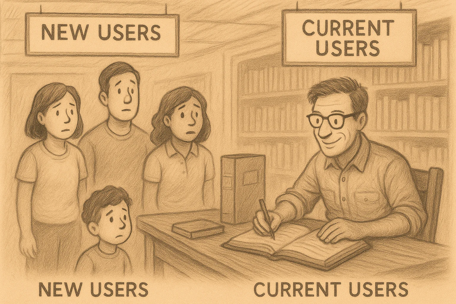
Defining the Target Audience
The Austin History Center (AHC) did not initially have a specific audience in mind, as its users varied widely. Early conversations revealed the challenge of narrowing down a target group, eventually suggesting a broad scope.
- Primary: New, curious individuals exploring historical resources for the first time.
- Secondary: Existing researchers and frequent users familiar with AHC’s resources.
- Tertiary: Staff providing customer service support to help users locate information
User Interviews
I led the effort to conduct user interviews, despite initial challenges with limited participants and scheduling conflicts. I proactively reached out to clients and utilized tools like Calendly to streamline scheduling. As a result, I successfully conducted 7 out of 9 interviews, focusing on gaining a deep understanding of user needs.

affinity mapping & FINDINGS
.png)
By utilizing an affinity diagram, I facilitated the process by encouraging each team member to watch the recorded interviews and review the transcripts I had uploaded. Once all insights and observations were listed, we grouped them into themes and considered business goals to prioritize those that were most feasible and valuable within the given timeline. This approach not only deepened our understanding of user feedback but also fostered collaboration, ensuring everyone was aligned and on the same page.
After collecting the data, I led a collaborative effort within the team to synthesize their feelings and find recurring themes.
This process helped us identify recurring themes and user pain points, directly shaping our design decisions. Keeping business goals in mind, I emphasized the importance of balancing user needs with business requirements—validating these challenges through our user interviews. Now there were about seven recurring themes, I can’t possibly see the advantage of trying to solve all of them at once, therefore I suggested to have a clear scope of work that allows us to design what is feasible and valuable therefore we focused on the following insights:
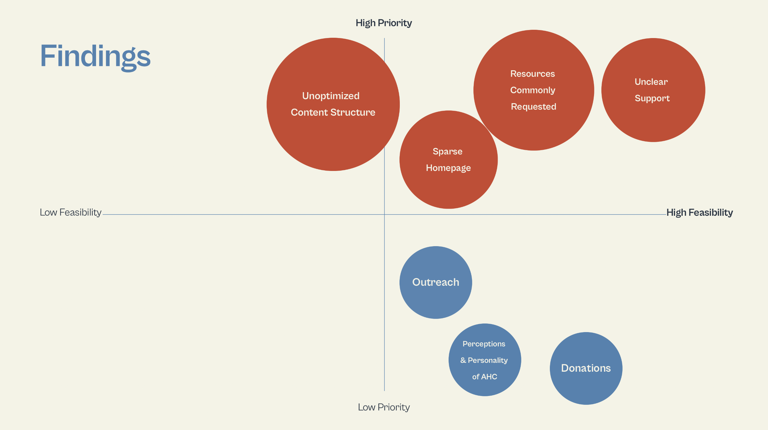
- Unoptimized Content Structure
- Sparse homepage
- Lack of Clear Guidance
Community Impact
Our research aimed not only to understand AHC’s diverse users but also to explore how we could create a positive impact on the community. By identifying user needs, pain points, and behaviors, we sought to make AHC’s historical content more accessible and inclusive for all users — especially those exploring archives for the first time.
Design Solutions
Problem Statement
How might we optimize and simplify the content organization to enable users to quickly find the information they need?
Finding #1 : Unoptimized Content Structure
Problems identified
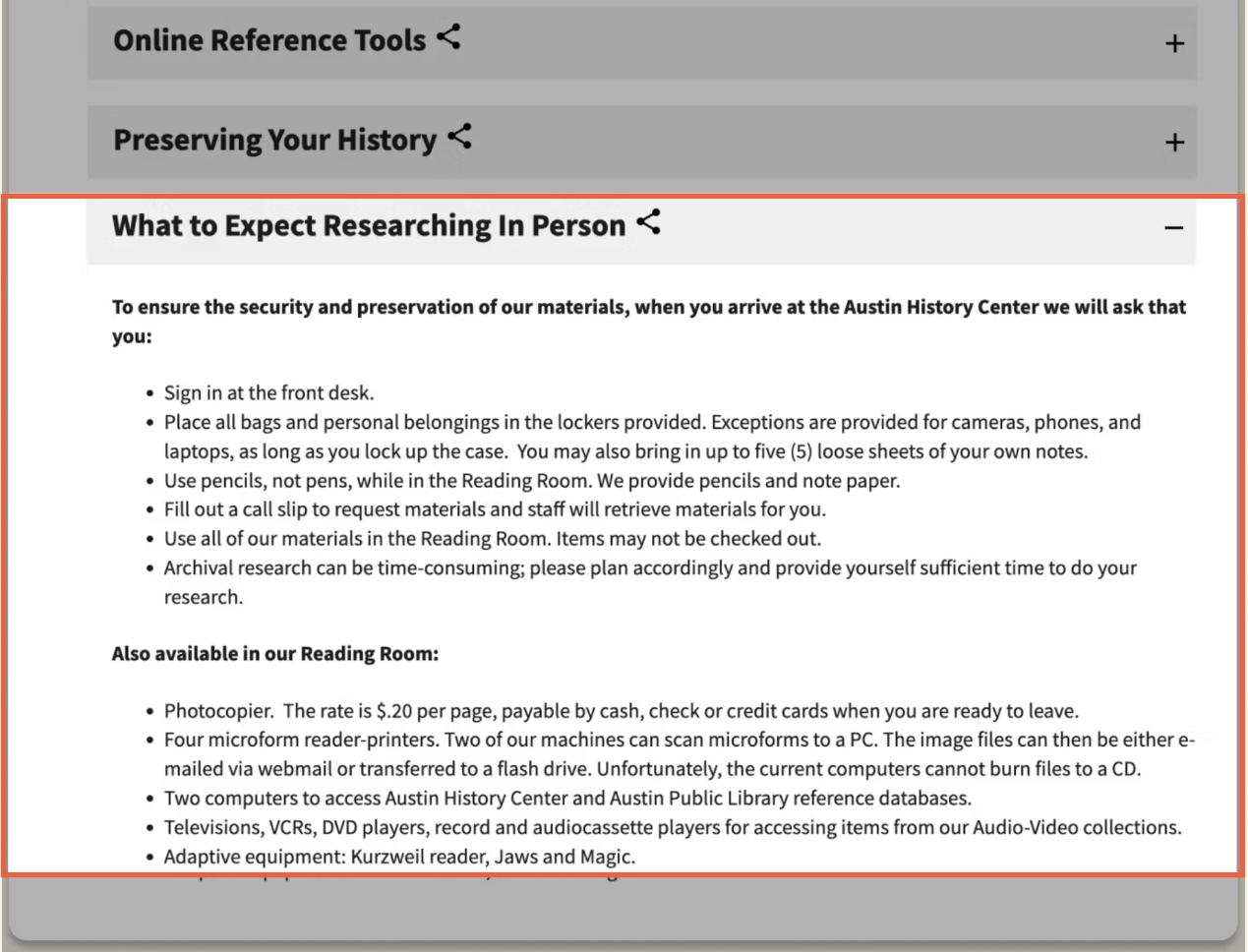
- Collapsed accordions hide information at first glance
- Content overload is not conductive to skimming
- Long line lengths impact readability
Support
“I think there's a lot of information that's being presented to the user through the website. And it's very verbose because you have, there's a lot of information that needs to be presented. “
-Maria-Elena, Reference Librarian
“There's not a search and if you do a control F on the site, it doesn't find anything that's in the collapsible parts”
- Tina, Librarian Supervisor
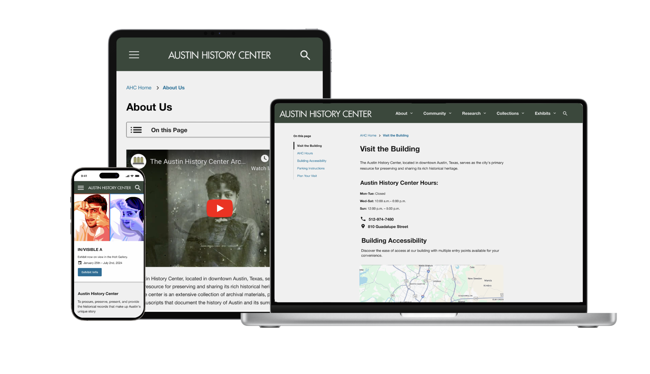
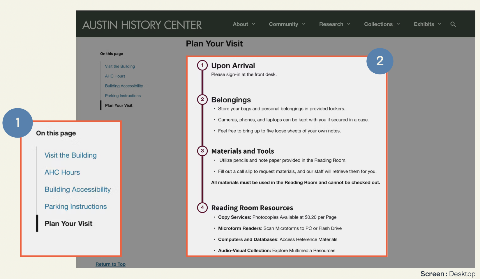
Opportunity #1: Table of Contents, Chunking, and Visual Hierarchy
My research and initial sketches laid the foundation for the final design. To enhance discoverability, anchor links were implemented, allowing users to navigate seamlessly. Additionally, I structured the content with a clear visual hierarchy, improving readability and addressing both user navigation challenges and the client's content organization goals.
Usability testing revealed that 80% of users utilized the anchor links, and all participants successfully found the information without assistance, demonstrating the effectiveness of these improvements.
Opportunities Implemented
- Anchor Links – Enhanced discoverability and streamlined navigation.
- Chunked Content with Visual Hierarchy – Improved readability and scanning.
- Clearer Content Organization – Aligned with user needs and client goals.
Impact
- 80% of users used anchor links during usability testing.
- 100% of users successfully found information without assistance.
Finding #2: Sparse homepage
Problems Identified
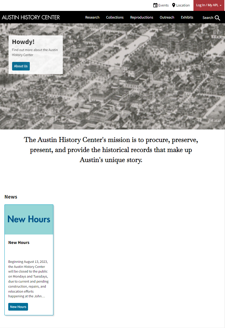
- Homepage lacks visual appeal
- Lack of CTA (call-to-action)
- Unclear what History Center offers at glance
- Unused valuable whitespace
Support
“And I do love the black bar with research collections, reproductions, and outreach exhibits. But I think the main webpage could do a little more to show that off, especially for new users.”
-Katie, Library Staff
“And I think it's fairly user-friendly, in figuring out where things were. I think the landing page is kind of boring, I guess.”
- Christina, Reference Librarian
Opportunity #2: Enhance Homepage
Based on initial user interviews, we refined the homepage layout to provide users with quick access to the most relevant information and resources used. The updated design includes dedicated sections for:
Opportunities Implemented
- Featured Exhibits
- Resources (prioritized based on user needs)
- Upcoming Events
- Contact Us Form for assistance

Finding #3 : Lack of Clear Guidance for Users
Problems identified
- Confusing hyperlinks that discourage users from engaging with the website
- Multiple PDF forms requiring manual completion, creating barriers for users
- Long line lengths impact readability
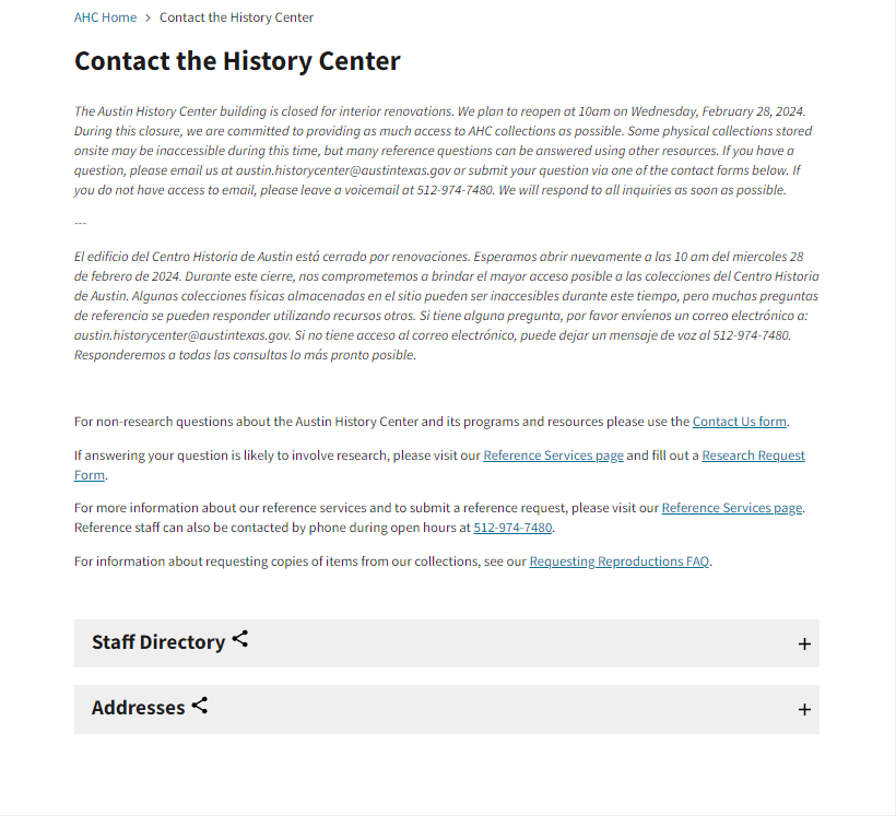
Support
“I know I need to ask a question, I just don’t know where to go online.”
-Natalie, Higher Education Scholarship Coordinator
“A divide between what kinds of research and reference services they can provide for free on demand and what kinds they actually charge for”
-Tina, Librarian Supervisor
Opportunity #3: Prominent Contact Form CTA
To address users' lack of awareness about contact services and their difficulty in seeking assistance, we took proactive steps to improve visibility and accessibility.
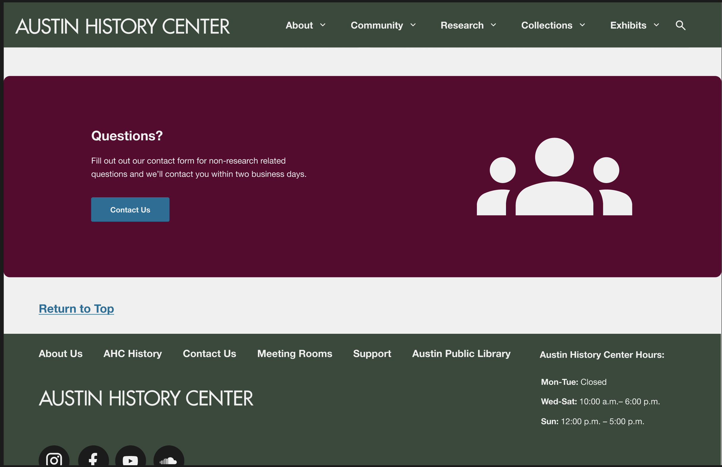
Opportunities Implemented
- Integrated Contact Form directly into the homepage – giving it a dedicated section for easy access.
- Visual Hierarchy – used a large, recognizable icon and applied a contrasting color scheme, ensuring it stands out and is easily identifiable for users in need of assistance.
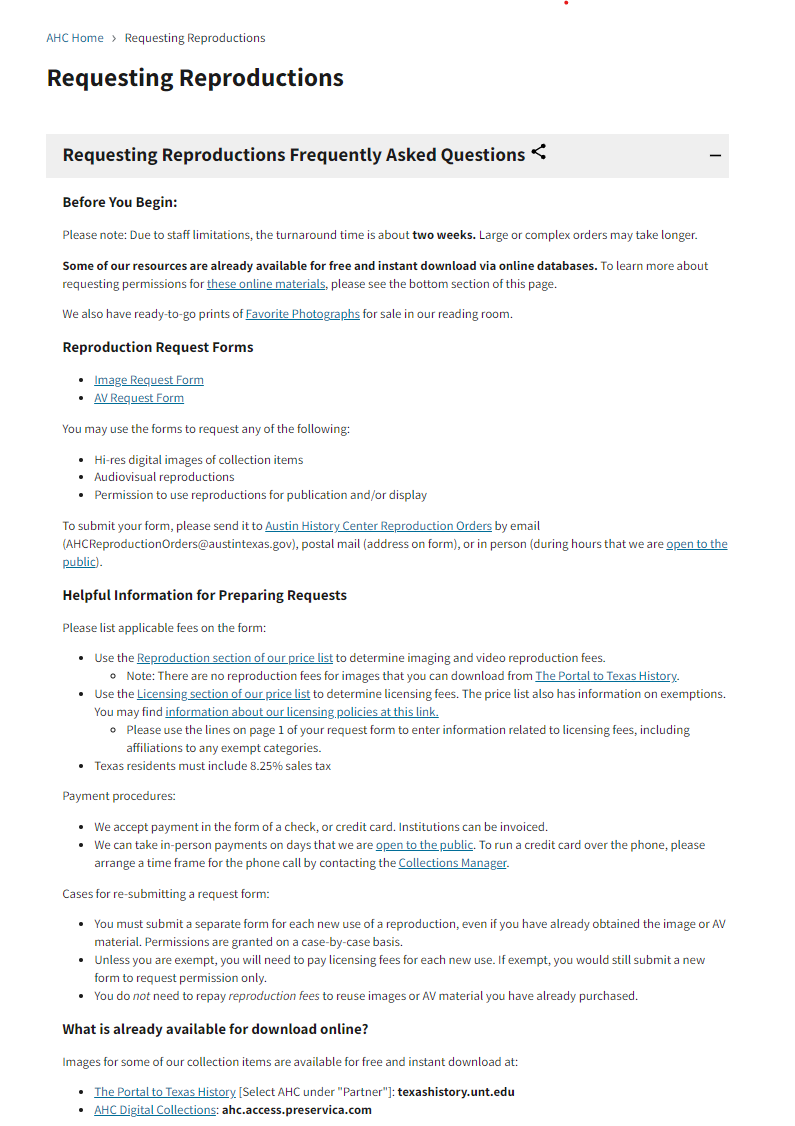
Streamline Forms (Next Steps)
- Moving forward, efforts will focus on streamlining forms for improved usability, removing duplicate PDFs, and eliminating irrelevant content.
- These enhancements will contribute to a more efficient, intuitive, and accessible browsing experience for all users.
Testing & Iteration
I conducted usability testing on the new designs to measure success metrics. The challenge arose when we ran two separate tests, each with different goals: one focused on navigation and content, and the other on visual appeal and readability.
Testing Approach
- Test 1: Navigation & Content – Evaluated how easily users could find information and interact with the website.
- Test 2: Visual Appeal &Readability – Assessed how users perceived the design and whether content was easy to digest.
The Struggle: This approach made it difficult to track progress over time, as we were measuring different aspects of the user experience. The lack of alignment between the two tests complicated our ability to analyze and compare the results effectively.
The Solution: Due to time constraints, additional rounds of testing weren’t feasible. However, a key takeaway was that design is an iterative process—even without immediate refinements, future iterations remain possible. Recognizing this allowed us to focus on high-impact from each test conducted and make improvements based on recurring pain points present.
Testing Objectives
- Identify Pain Points – Uncover user challenges with navigation, content discoverability, and overall usability on the Homepage, About Us, and Visit Us pages.
- Assess Task Success Rates – Measure how effectively users completed key tasks to evaluate usability.
- Gather User Feedback – Collect qualitative insights on content clarity, navigation structure, and overall user experience.
Rainbow Analysis: Identifying Patterns in User Feedback
This approach helped identify recurring pain points, behaviors, and opportunities for improvement. By categorizing observations with a color-coded system, we could pinpoint the most critical usability issues and prioritize them for iteration.
Key Iterations
Content & Labeling Updates
- Changed "About AHC" to "About Us" for clarity.
- Updated "Plan Your Visit" to "Visit the Building" to better align with user expectations.
- Added Operating Hours & Address to footer and contact pages for easier discovery.
Layout & Design Adjustments
- Improved Anchor Links with bold styling, underlines, and hover effects for better visibility.
- Desktop: Changed the Resources section to a 4-column layout and slightly reduced the size for better readability.
- Exhibits & Events:Updated placeholder dates and event info to reflect a more realistic display.Added a placeholder Events section for future content expansion.
Key Takeaways
Accessibilty is more than color
Accessibility goes beyond color contrast—it's about the whole user experience. It means designing for everyone, including those with visual, hearing, motor, or cognitive challenges. That includes keyboard navigation, screen reader support, alt text, video captions, and clear, simple language.
Team Dynamics
UX often comes with ambiguity—in both the work and team dynamics. This taught me to step up when needed, support others, and create a collaborative environment. When expectations around tasks or deadlines were unclear, I learned to define roles and clarify what “done” really means. These moments reinforced the value of clear communication and alignment. A supportive team makes all the difference, and I’m proud that my peers appreciated my collaborative approach.
Design Process is not Project Management
I quickly learned that design isn’t one-size-fits-all. Sticking to a rigid process had us repeating work and wasting time. Once we embraced flexibility, used existing insights, and followed a more agile approach, we moved faster and focused on what mattered most. This experience showed me that adapting the process to fit each project is key to working smarter and delivering better results.4o
Clear Business Goals
Balancing user needs with client goals was a key challenge. I learned the value of clarifying business objectives early and asking the right questions to align them with user pain points. When the scope grew too ambitious, I recognized the importance of setting boundaries and clearly communicating what was out of scope. Going forward, I’ll focus on realistic goal-setting and open communication to keep projects aligned.
Final Thought
Be Proactive and Flexible.
Things don’t always go as planned, and that’s okay. The key is to address issues as they arise, communicate effectively, and adapt with a positive mindset.
“Don’t borrow from tomorrow’s problems.”
― Jennifer L. Armentrout
Next Steps
Not all problems can be solved at once, and design is an ongoing process of iteration and improvement. While we addressed key usability challenges, there are still opportunities to enhance the experience further. Our next steps include:
Update the Staff Directory Page
Improve organization and accessibility to help users find staff members more easily.
Consolidate Forms
Streamline contact forms to reduce confusion, ensuring users can quickly identify the correct form for their needs.
Spanish Language Support
Expand accessibility by providing key content in Spanish to better serve a diverse user base.
Perform Further Usability Testing
Continue testing to validate improvements, ensuring that labeling, navigation, and interactions align with accessibility guidelines for all users.

Finished Product